


Slice And Dice: Comparing Values Over Specific Times With Splunk Dashboards — Part Two
By Marvin Martinez, Team Lead – Security Operations
Part Two: Isolate and Compare
Welcome back to our series discussing some unique ways to visualize data across specific points in time with Splunk SPL! In Part One, we created a dashboard chart to show day over week values over multiple weeks. In this segment, we will expand on our previous chart and isolate and compare one day from a specific week to the same day from the current week and show the percentage change between the two values across the day in a new area chart visualization.
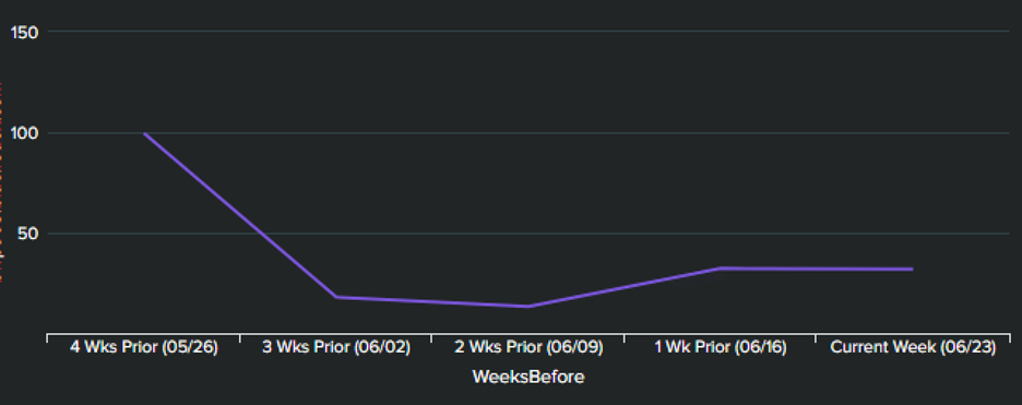
Using our sales example from our first installment (shown below), we showed a full day across 4 weeks, overlaid in one line chart visualization. Now, what if, after analyzing this at a high level, you wanted to display percentage changes between the latest Thursday (red line) and the Thursday 3 weeks back (blue line)?
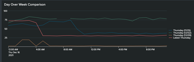
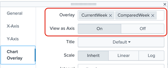
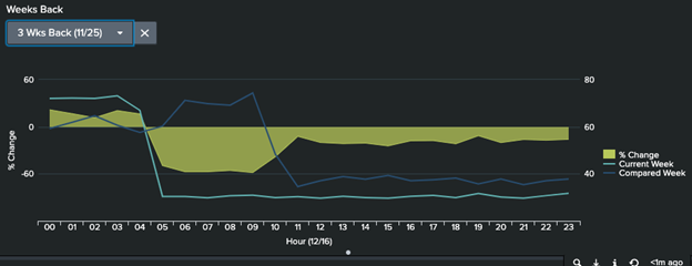
Once we’re done, our visualization will look as shown below. In the image below, a dropdown input is populated with the options for the last 3 weeks and is passing a value of 1-3 to send as a token to the panel search in order to determine which week to compare with the day from the current week. The panel itself consists of an area chart visualization that will be formatted with the week values as chart overlays to highlight the percentage change.

Since the search is a little extensive and consists of various parts, let’s view the complete search first and then break it down to its various steps to make it easier to digest. This is the search that was used for the panel above. The field being used for the chart is the TotalSales field.
index=test …
| eval Date = strftime(_time,"%m/%d"), Day = strftime(_time,"%A"), Hour=strftime(_time,"%H"), TotalSales = round(TotalSales,2)
| fields  _time, "TotalSales", Hour, Day, Date
| where Day = "Thursday"
| sort 0 - _time
| streamstats dc(Date) as WeekNum current=true
| eval WeekNum = WeekNum - 1
| where WeekNum = 0 OR WeekNum = 3
| stats values(LatestWeek) as CurrentWeek, values(PriorWeek) as PriorWeek, values(eval(if(WeekNum=0,Date,NULL()))) AS Date by Hour
| eval CurrentWeek = IF(ISNULL(Date),"",CurrentWeek), Delta_Percentage = round(((CurrentWeek - PriorWeek)/PriorWeek) * 100,2)
| eval xAxis = "Hour (" . Date . ")"
| eval {xAxis} = Hour
| rename CurrentWeek AS "Current Week", PriorWeek as "Compared Week", Delta_Percentage AS "% Change"
| fields "Hour *" "% Change" "Current Week" "Compared Week"
Let’s break this search down and explain what is going on here. The first 4 lines are setting up our data. We create fields to store the specific Date, Day, and Hour for our values as well as filter out only the information for the specific day we are looking to compare. In this case, Thursday is the selected day but this could easily be replaced with a token here to allow dynamic selection of any day of the week.
| sort 0 - _time
| streamstats dc(Date) as WeekNum current=true
| eval WeekNum = WeekNum - 1
| where WeekNum = 0 OR WeekNum = 3
These next 4 lines of the search allow us to filter for the day of the current week and the day of the selected week. A quick way to do that here is to sort the result set in descending date order, then running a streamstats command to get the distinct number of weeks. Using this strategy, it makes it much easier to be able to configure a dropdown input to easily allow someone to simply select any previous week with just a number. In this case, the where command is filtering for WeekNum = 0 or WeekNum = 3, which will isolate only the values for the Thursday of the current week or the Thursday 3 weeks back. This “3” value is where you could instead use a token from a dropdown to allow for dynamic selection of different weeks back. At this point, we have now isolated our result set to solely the two days we are looking to compare.
| stats values(LatestWeek) as CurrentWeek, values(PriorWeek) as PriorWeek, values(eval(if(WeekNum=0,Date,NULL()))) AS Date by Hour
| eval CurrentWeek = IF(ISNULL(Date),"",CurrentWeek), Delta_Percentage = round(((CurrentWeek - PriorWeek)/PriorWeek) * 100,2)
Now that we have isolated our data, we can use stats to perform our aggregation and group our values according to each hour of the day into their own separate fields. Since our result set is now only from the current week and the selected week in the past then, logically, the “latest” value will be from the current week and the “earliest” value will be from the previous, selected week. We group these by Hour of the day and each event will now have the value for each hour from both days. Crucially, this is what we need in order to be able to calculate the percentage delta between periods. Note that the Date field is pulled so we can have the latest date reflected in our x-axis for reference, as we’ll see later. The following eval command nulls out any CurrentWeek values when the Date field is also null to avoid any issues with the charting if Date values are null but those CurrentWeek values are not. Additionally, we calculate the Delta_Percentage between the two values.
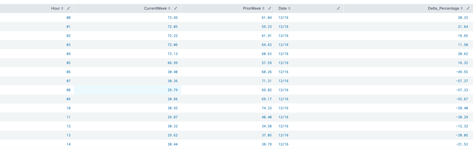
At this point, if you ran the search up to our latest command, your results should return a table with the Hour of the day, a CurrentWeek and PreviousWeek value for each of the days being compared, the date of the day of the current week, and the delta percentage between the day from the current week and the week being compared.
Now, all that remains is to get all the fields named in a more presentable fashion before we prepare our chart. That’s what the last 4 lines in our SPL achieve.
| eval xAxis = "Hour (" . Date . ")"
| eval {xAxis} = Hour
| rename CurrentWeek AS "Current Week", PriorWeek as "Compared Week", Delta_Percentage AS "% Change"
| fields "Hour *" "% Change" "Current Week" "Compared Week"
The first line above assigns a field (xAxis) with the string “Hour” followed by the date of the “current day” being compared in parentheses. In this example, that text will read “Hour (12/16)”. Then, in the second line, that text is used to create a field by that name (the field label in braces) and is assigned the value of the Hour. In the last two lines, we just rename our fields to be more presentable and then leave only the Hour (using the “Hour *” wildcard to allow for the date in the field label), % Change, Current Week and Compared Week.
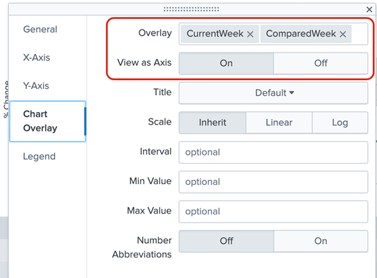
Finally, we can configure our visualization! Format the panel/visualization as an area chart. Assign Current Week and Compared Week as Chart Overlay fields and set them to be on their own axis.
This will show the two values as lines on the chart and leave the % Change field as the shaded area between them to help visualize the percentage difference between the Thursday this week and the Thursday 3 weeks ago, across every hour of the day. Until next time!
Stay tuned for our next installment in this series on unique Splunk Dashboard panels, when we will discuss how to pick one single value from the day (i.e. a specific hour value) and plot it back across the same hour and day from previous weeks in one line! A sample image is shown below.