


Spruce Up Your Dashboard Panels with Dynamic Y-Axis Labels/Units
By: Marvin Martinez | Splunk Consultant
Dashboards in Splunk, and the panels within those dashboards, are extremely versatile and powerful. Sometimes, however, wide variances in the underlying data being analyzed and displayed in those panels can make it hard to effectively relay that information when the data has varying degrees of magnitudes or when you’d like the axes to contain dynamic labels depending on the data being shown. Today, we’ll look at a relatively small, but mighty, method that can be implemented in your dashboards to help bolster the way your dashboard panels display your key data.
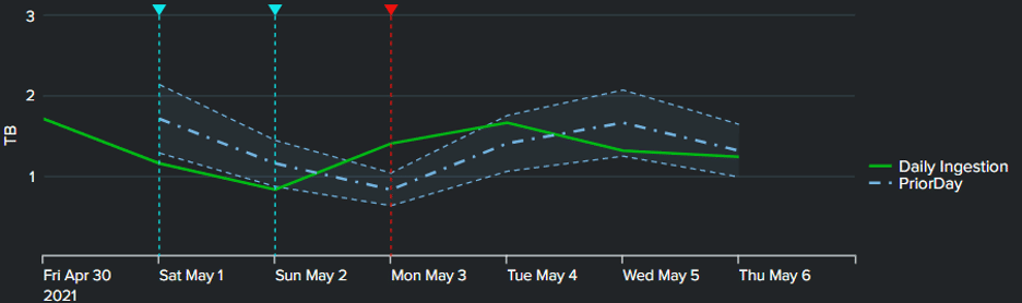
In this example, we’ll examine a case where a panel is displaying metrics for daily ingestion for a given index. The data is coming from a summary index and shows ingested megabytes (MB) over time. However, depending on the index, the ingestion may be better displayed in terms of GB, or even TB. In this case, the y-axis of the chart would not look its best if the values looked like “2,000,000 MB” as that is not a practical and easy-to-read display of the data.
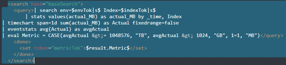
The first step is to determine what units are most prudent to display for the index in question. To do this, a global base search is leveraged to determine the expected units. In the example search below, the base search retrieves all the MB values for the specified index, takes an average of the values, and compares it against thresholds for TB (1024*1024 MB), GB (1024 MB), and MB (default case). Depending on the value of the average, the search returns a specific “Metric” (or “Units”) result that is inserted into a dashboard token that will be used later.
Once the desired units are determined, there are only two things that need to be done to ensure any visualization going forward can leverage it accurately and successfully:
- Ensure your chart SPL is doing the same conversion (“normalization”) to ensure data integrity.
- Assign the derived unit’s value as the y-axis label.
In the visualization SPL, the eval statement below was included to “normalize” the data and ensure that the actual values match the units that are noted by the y-axis label. Do this for any other values that may need to be normalized as well. If necessary, the “Metric” field can be removed in your SPL later, or you could just use the token in the CASE statement itself. The “Metric” field was just created for ease of use in the subsequent eval expression.
|eval Metric = $metricTok|s$, Actual = CASE(Metric = “MB”, Actual, Metric= “GB”, round(Actual/1024,2), Metric = “TB”, round(Actual/1024/1024,2))
Finally, in the options for your chart, add an entry for “charting.axisTitleY.text” and assign the dashboard token set in your base search as the value, as shown below.

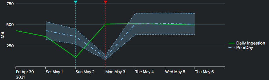
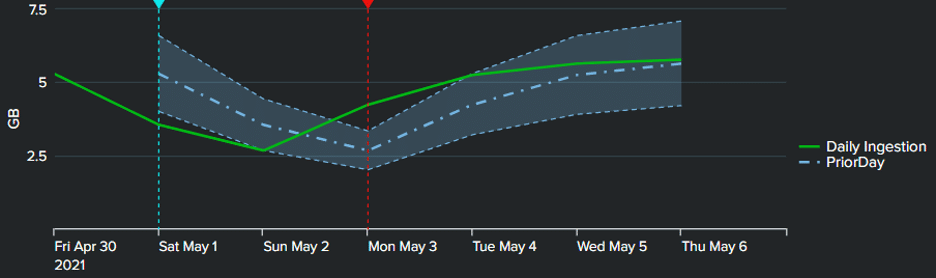
The end result, as shown in the images below, is a dynamic y-axis label that adjusts to the units that best suit the underlying data and make it easy to read instead of having to wade through various zeroes in the intervals! The images below are the same chart displaying data from three separate indexes with varying ingestion totals, each displaying in the units best suited for the selected index.
Using tokens allows for great versatility and power in your dashboards. Now, even the axes can be easily configured to dynamically adjust to your wide-ranging values.
Want to learn more about customizing your Splunk dashboards? Contact us today!