


Slice And Dice: Comparing Values Over Specific Times With Splunk Dashboards — Part Three
By Marvin Martinez, Team Lead – Security Operations
Part Three: Specific Hour Over Day Visualization
Welcome back to our series discussing some unique ways to visualize data across specific points in time with Splunk SPL! Previously, we created a dashboard chart to isolate and compare a specific day from a prior week, and then we isolated and compared it to the same day from the current week to see the percentage change between the two values across the day in a new area chart visualization. In this installment, we will pick a specific hour from one day and chart out those specific values across a prior set of weeks in a straightforward visualization.
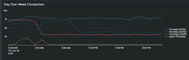
Referring back to our first installment (Figure 1 below), we showed a full day across four weeks, overlayed in one line chart visualization. Then, in our second installment, we isolated one of these specific days to compare to the current week (Figure 2).
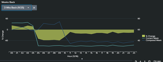
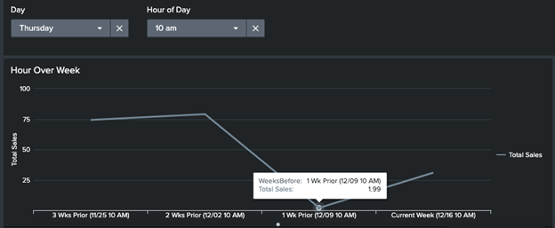
Now, for example, let’s say we noticed that spike at 10 am where the Compared Week is much higher than the Current Week and we want to see if that’s just an anomaly or a consistent trend at that same hour. One thing that would make it easy to visualize this would be a line chart that charts that specific hour for that day of the week across the past 4 weeks.
Let’s build that very search! Once we’re done, our visualization will look as shown below. In the image below, two dropdown inputs are populated with the specified day of the week and hour to isolate for the past 4 weeks, including the current week. This is just a line chart but it is isolated to just that specific day/hour across the past 4 weeks, which makes it much easier to visualize without any other data points to distract the view.
The complete search consists of various parts and transformation so let’s break it up into the few major steps that comprise it and analyze it to ensure we understand how this cake is baked. The final search is below:
Index=test…
| eval Date = strftime(_time,"%m/%d %I %p"), Day = strftime(_time,"%A"), Hour=strftime(_time,"%H"), TotalSales = round(TotalSales,2)
| fields _time, "TotalSales", Hour, Day, Date
| where Day="Thursday" AND Hour = 10
| sort 0 - _time
| streamstats dc(Date) as WeekNum current=true
| eval WeekNum = WeekNum -1, WeeksBefore = WeekNum . CASE(WeekNum = 0, " Current Week",WeekNum = 1, " Wk Prior",1=1," Wks Prior") . " (" . Date . ")"
| chart values(TotalSales) as "Week Value" by WeeksBefore
| sort 0 - WeeksBefore
| eval WeeksBefore = IF(match(WeeksBefore,"^0\s"),substr(WeeksBefore,3),WeeksBefore)
Now let’s break this search down and explain what is going on here. The first four lines are setting up our data. We create fields to store the specific Date, Day and Hour for our values as well as filter out only the information for the specific days and hour we are looking to compare. In this case, Thursday is the selected day and 10 am is the selected hour but this could easily be replaced with a token here to allow dynamic selection of any day of the week (it actually is in our specific dashboard).
| sort 0 - _time
| streamstats dc(Date) as WeekNum current=true
| eval WeekNum = WeekNum -1, WeeksBefore = WeekNum . CASE(WeekNum = 0, " Current Week",WeekNum = 1, " Wk Prior",1=1," Wks Prior") . " (" . Date . ")"
The next three lines of the search allow us to format and prepare the data so that the chart will be easy to understand with descriptive labels on the x-axis. The sort command just sorts our data by descending time order so that the subsequent streamstats command can appropriately categorize the date in terms of how many weeks before the event is in relation to the current week. The eval command after this takes the WeekNum value, adjusts it so it reflects the appropriate relation to current week and then creates a WeeksBefore field that contains text values to better articulate how many weeks before the value presented is from, as well as identifying the current week and labeling it appropriately. We’ll discuss what needs to be further finalized on this field for optimal readability a bit later but we can continue for now.
| chart values(TotalSales) as "Week Value" by WeeksBefore
| sort 0 - WeeksBefore
| eval WeeksBefore = IF(match(WeeksBefore,"^0\s"),substr(WeeksBefore,3),WeeksBefore)
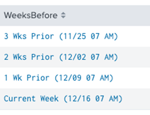
Now that we’ve isolated and appropriately categorized and formatted our data, all that is needed is a chart command to group the values by the WeeksBefore field. Then, sort the results in descending order by WeeksBefore to ensure that the values are displayed in chronological order once placed in the visualization/line chart. If you were to run the search at this point, you’d notice that the WeeksBefore field has values like this:
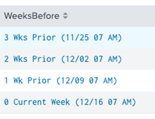
In order to get the field to display the right value for the current week (without the 0), the eval command at the end cleans up the data so that the “Current Week” value for WeeksBefore is labeled appropriately using the match function with some simple regex. Once applied, the values look as follows:
The visualization is now ready! It will display much like a timechart but over a certain time period for only that day/hour data point across multiple weeks and with helpful, dynamic, and descriptive labeling on your x-axis!
Stay tuned for our fourth and final installment in this series on unique Splunk Dashboard panels, when we will discuss how to pick one single time value from a day (i.e. a specific hour value) and plot that data point back across various weeks, comparing each prior data point to the current week (same hour/day) and showing percentage deltas along the way. A sample image is shown below.
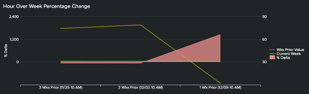
Part Four Sneak Peek: Hour Over Week Percentage Change Timechart (Figure 6)
Until next time, please contact us for more information on this specific Splunk dashboard tutorial, or any Splunk questions you may have!