


Creating Chart Overlays and Annotations (Flags) in a TimeChart
The TimeChart function is one of most used visualizations of Splunk Dashboards, easily showing the volume of specific events, broken down by category over time. In certain situations, you may want to overlay additional data on top of your time chart to highlight certain events that correlate with the time chart. Luckily the masterminds at Splunk have already thought of a clever way on how we can flag certain search results and overlay it: Annotations!
It’s not as simple as clicking a few buttons on your dashboard. Don’t be worried though, it’s not difficult either! As long as looking at the XML source doesn’t scare you, you’ll be fine. Let’s continue.
Create a Chart Overlay
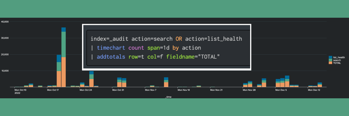
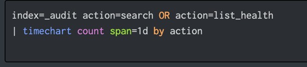
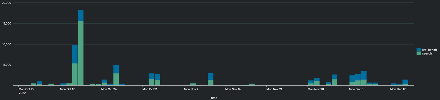
In this example we’ll be using the Simple XML Dashboard. The below data will show a count of events over the span of 2 months. They’re placed into 1-day buckets using the span argument.
Additionally, we’ll group these events by their action so we can distinguish the two different actions.
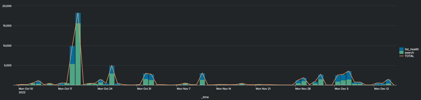
This gives us a TimeChart that will look like this:
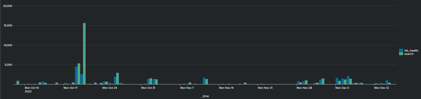
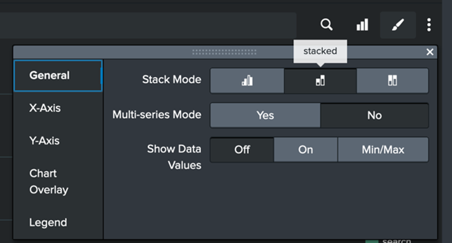
Now, let’s stack our chart to reduce clutter across the TimeChart.
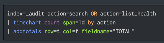
To give us more clarity in our data, we can also add an overlay to show the total of both groupings. We can do this with the addtotals command.
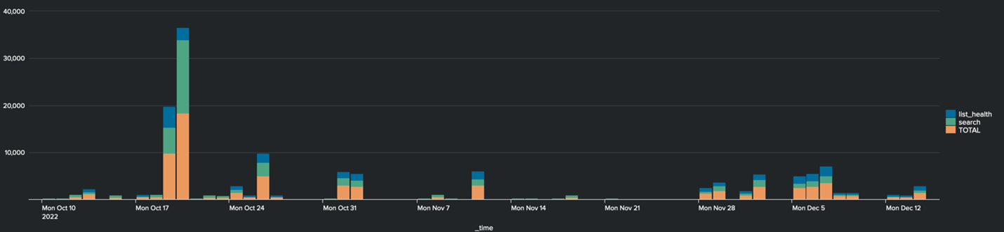
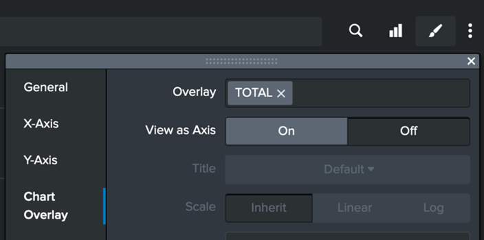
Now we can use the new field created by the addtotals command, to overlay in the Dashboard settings.
This gives us a Dashboard that looks like this. You’ll see the orange TOTAL line is now added to the TimeChart.
Now for the fun part. Let’s add in the Annotations, or flags, to highlight certain events.
In this example, I’ll just be using a unique timestamp value from 3 of the events, but in real world situations you could use a dynamic search to flag server reboots or critical errors on an application.
To add the Annotations:
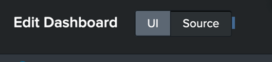
1) Go into ‘Edit’ on your Dashboard and modify the XML source.
2) Find the <chart> for your TimeChart in the XML
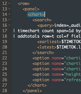
3) Insert this annotation XML directly below the opening <chart> tag:
<search type="annotation">
<query>YOUR SPL QUERY HERE
| eval annotation_label = “ANNOTATION LABEL – FREE TEXT HERE (optional)”
| eval annotation_category = “SPECIFY A SPLUNK FIELD HERE (optional)”
</query></search>
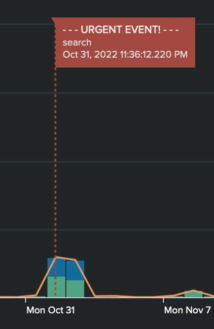
After saving the XML, you’ll see your annotations display on your TimeChart if it found matching events. It may look something like this:
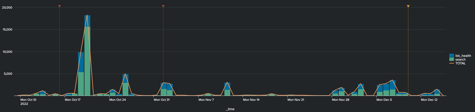
If you hover over the annotation label, you’ll see what we defined under the eval annotation commands.
Voila! You’ve got yourself a powerful visualization, able to show multiple data sources and correlate them together through the TimeChart command. Happy Splunking!